"Gray skies are just clouds passing over."- Frank GiffordIf I had to pick a favorite color I'd have to say it depends on the application, the surrounding lighting, the space, the texture... I suppose there isn't just one color. I thought I knew exactly what color I wanted for the overall house color. I was wrong.
The color I had just painted my house in Washington was a warm gray, Requisite Gray by +Sherwin-Williams. The ceilings were on the taller side, the rooms were spacious, the lighting was great. The color looked warm and inviting and the white for inch trim popped. Our 1905 historic home looked regal, I thought so anyway.
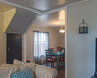
Our newly acquired duplex is a completely different matter. It was built in 1978, has low ceilings, small windows and giant trees all around. No natural light and low ceilings equals dark cave. My trustworthy light warm gray was immediately discarded.
The quest for a new gray took me to Pinterest and Sherwin Williams Color Snap App of course. I went from Alpaca to Repose to Mindful to Passive, Heron Plume and everything in-between. Sample after sample painted on the walls. If it looked great in the living room it looked awful in the dining room and visa versa.
After a week of my sister in law and I staring at color swatches and samples we trecked to our local Sherwin Williams store and got a printout of the tint formulas of every color we had considered. What a revelation! The color I needed for my space was Crushed Ice. I never considered it even once. It looked too light and too cold on its little paint chip and not likeable in the app. However, it was all in the numbers. I didn't even buy a sample of it. I knew it was just right and went straight for the 5 gallon bucket! Here's to finding the perfect gray!!


No comments:
Post a Comment